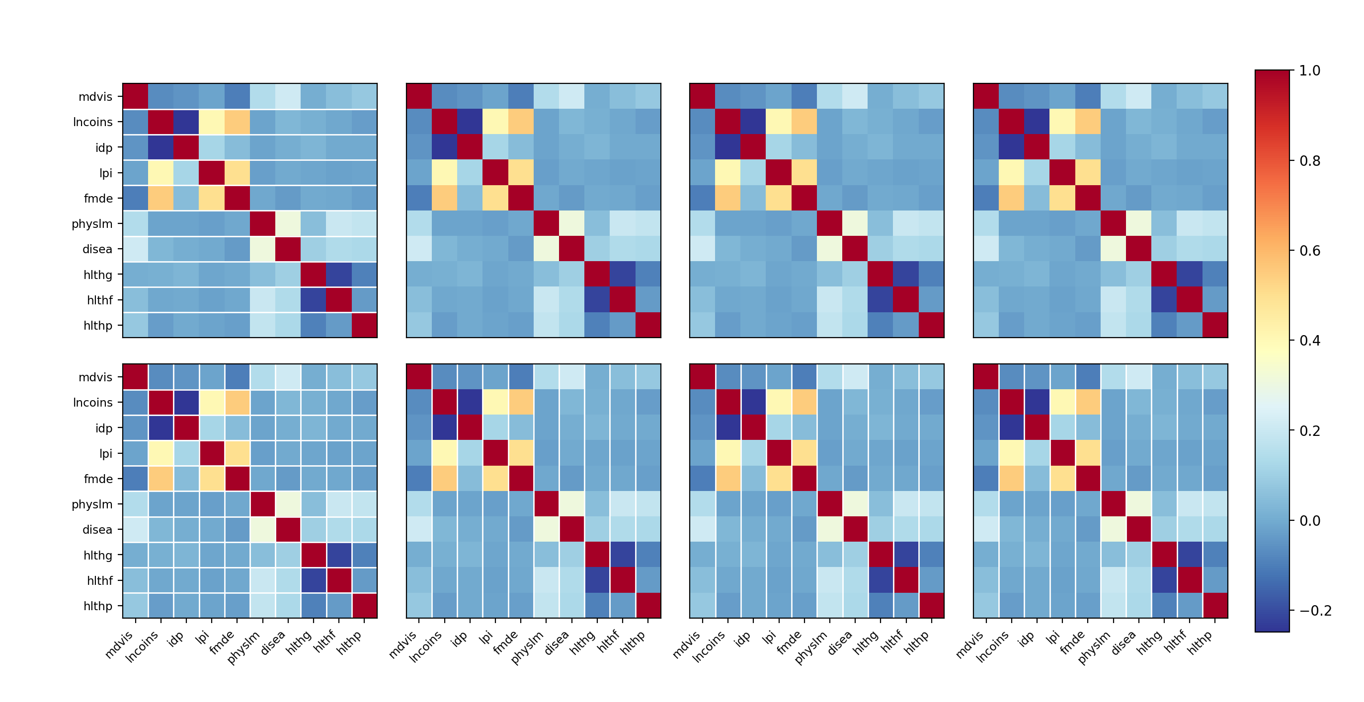
statsmodels.graphics.correlation.plot_corr_grid
- statsmodels.graphics.correlation.plot_corr_grid(dcorrs, titles=None, ncols=None, normcolor=False, xnames=None, ynames=None, fig=None, cmap='RdYlBu_r')[source]
Create a grid of correlation plots.
The individual correlation plots are assumed to all have the same variables, axis labels can be specified only once.
- Parameters:
- dcorrs
listor iterableofndarrays List of correlation matrices.
- titles
list[str],optional List of titles for the subplots. By default no title are shown.
- ncols
int,optional Number of columns in the subplot grid. If not given, the number of columns is determined automatically.
- normcolorbool or
tuple,optional If False (default), then the color coding range corresponds to the range of dcorr. If True, then the color range is normalized to (-1, 1). If this is a tuple of two numbers, then they define the range for the color bar.
- xnames
list[str],optional Labels for the horizontal axis. If not given (None), then the matplotlib defaults (integers) are used. If it is an empty list, [], then no ticks and labels are added.
- ynames
list[str],optional Labels for the vertical axis. Works the same way as xnames. If not given, the same names as for xnames are re-used.
- fig
Figure,optional If given, this figure is simply returned. Otherwise a new figure is created.
- cmap
strorMatplotlibColormapinstance,optional The colormap for the plot. Can be any valid Matplotlib Colormap instance or name.
- dcorrs
- Returns:
FigureIf ax is None, the created figure. Otherwise the figure to which ax is connected.
Examples
>>> import numpy as np
>>> import matplotlib.pyplot as plt
>>> import statsmodels.api as sm
In this example we just reuse the same correlation matrix several times. Of course in reality one would show a different correlation (measuring a another type of correlation, for example Pearson (linear) and Spearman, Kendall (nonlinear) correlations) for the same variables.
>>> hie_data = sm.datasets.randhie.load_pandas()
>>> corr_matrix = np.corrcoef(hie_data.data.T)
>>> sm.graphics.plot_corr_grid([corr_matrix] * 8, xnames=hie_data.names)
>>> plt.show()
(
Source code,png,hires.png,pdf)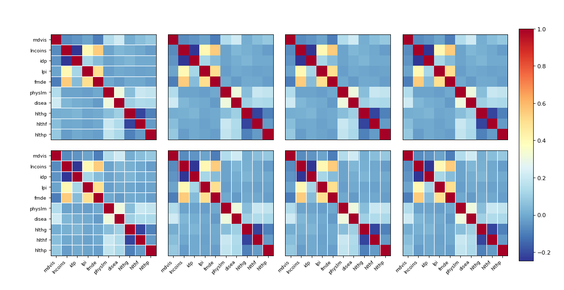