statsmodels.graphics.mosaicplot.mosaic
- statsmodels.graphics.mosaicplot.mosaic(data, index=None, ax=None, horizontal=True, gap=0.005, properties=<function <lambda>>, labelizer=None, title='', statistic=False, axes_label=True, label_rotation=0.0)[source]
Create a mosaic plot from a contingency table.
It allows to visualize multivariate categorical data in a rigorous and informative way.
- Parameters:
- data{
dict,Series,ndarray,DataFrame} The contingency table that contains the data. Each category should contain a non-negative number with a tuple as index. It expects that all the combination of keys to be represents; if that is not true, will automatically consider the missing values as 0. The order of the keys will be the same as the one of insertion. If a dict of a Series (or any other dict like object) is used, it will take the keys as labels. If a np.ndarray is provided, it will generate a simple numerical labels.
- index
list,optional Gives the preferred order for the category ordering. If not specified will default to the given order. It does not support named indexes for hierarchical Series. If a DataFrame is provided, it expects a list with the name of the columns.
- ax
Axes,optional The graph where display the mosaic. If not given, will create a new figure
- horizontalbool,
optional The starting direction of the split (by default along the horizontal axis)
- gap{
float, sequence[float]} The list of gaps to be applied on each subdivision. If the length of the given array is less of the number of subcategories (or if it’s a single number) it will extend it with exponentially decreasing gaps
- properties
dict[str,callable],optional A function that for each tile in the mosaic take the key of the tile and returns the dictionary of properties of the generated Rectangle, like color, hatch or similar. A default properties set will be provided fot the keys whose color has not been defined, and will use color variation to help visually separates the various categories. It should return None to indicate that it should use the default property for the tile. A dictionary of the properties for each key can be passed, and it will be internally converted to the correct function
- labelizer
dict[str,callable],optional A function that generate the text to display at the center of each tile base on the key of that tile
- title
str,optional The title of the axis
- statisticbool,
optional If true will use a crude statistical model to give colors to the plot. If the tile has a constraint that is more than 2 standard deviation from the expected value under independence hypothesis, it will go from green to red (for positive deviations, blue otherwise) and will acquire an hatching when crosses the 3 sigma.
- axes_labelbool,
optional Show the name of each value of each category on the axis (default) or hide them.
- label_rotation{
float,list[float]} The rotation of the axis label (if present). If a list is given each axis can have a different rotation
- data{
- Returns:
References
- A Brief History of the Mosaic Display
Michael Friendly, York University, Psychology Department Journal of Computational and Graphical Statistics, 2001
- Mosaic Displays for Loglinear Models.
Michael Friendly, York University, Psychology Department Proceedings of the Statistical Graphics Section, 1992, 61-68.
- Mosaic displays for multi-way contingency tables.
Michael Friendly, York University, Psychology Department Journal of the american statistical association March 1994, Vol. 89, No. 425, Theory and Methods
Examples
>>> import numpy as np
>>> import pandas as pd
>>> import matplotlib.pyplot as plt
>>> from statsmodels.graphics.mosaicplot import mosaic
The most simple use case is to take a dictionary and plot the result
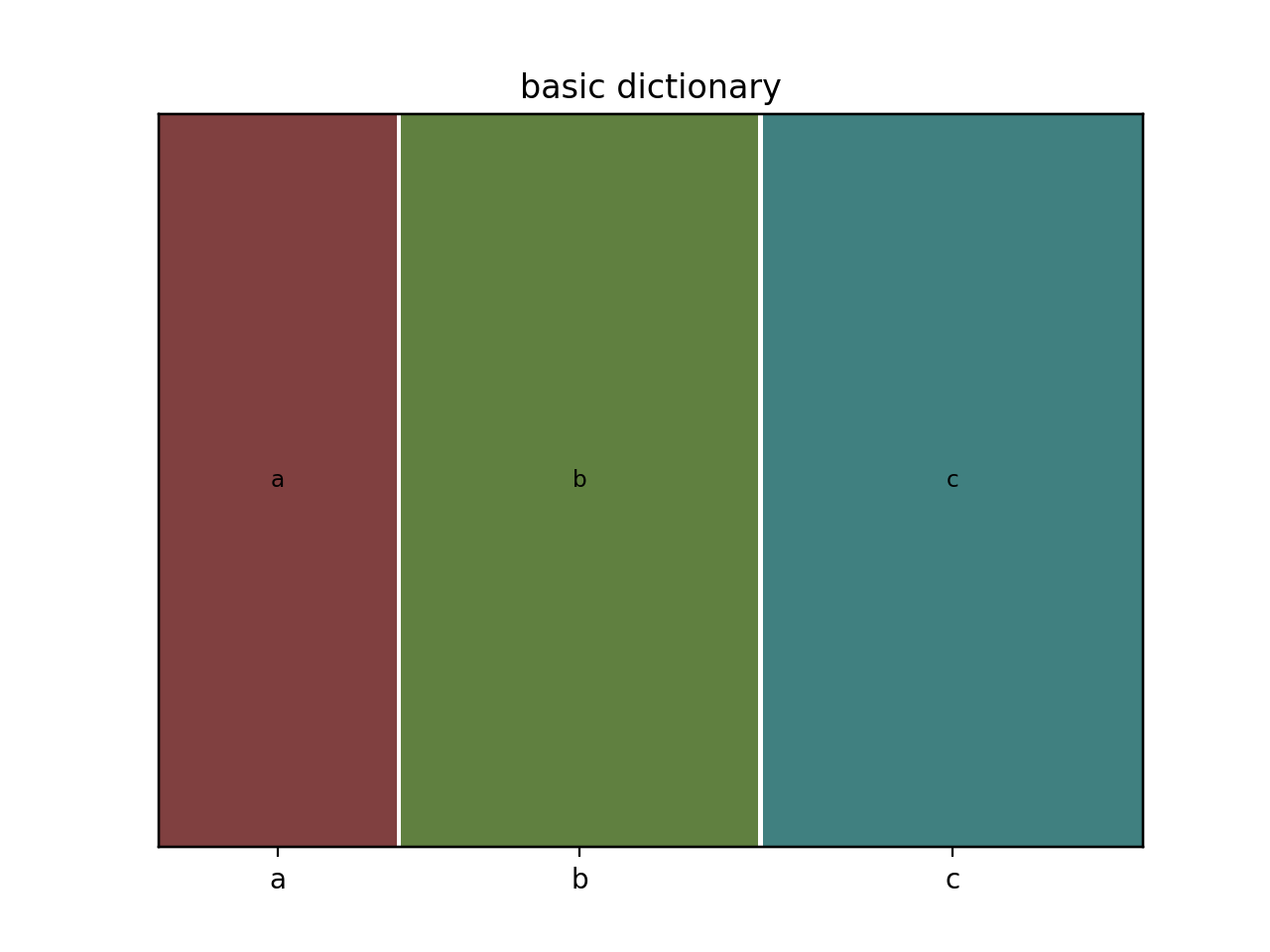
>>> data = {'a': 10, 'b': 15, 'c': 16}
>>> mosaic(data, title='basic dictionary')
>>> plt.show()
A more useful example is given by a dictionary with multiple indices. In this case we use a wider gap to a better visual separation of the resulting plot
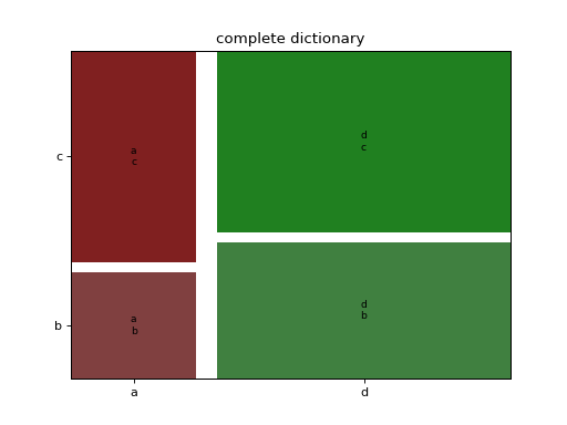
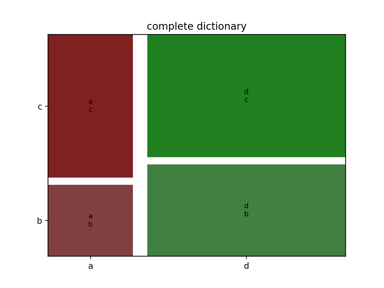
>>> data = {('a', 'b'): 1, ('a', 'c'): 2, ('d', 'b'): 3, ('d', 'c'): 4}
>>> mosaic(data, gap=0.05, title='complete dictionary')
>>> plt.show()
The same data can be given as a simple or hierarchical indexed Series
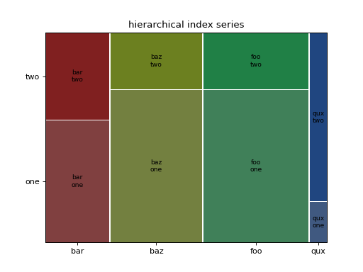
>>> rand = np.random.random
>>> from itertools import product
>>> tuples = list(product(['bar', 'baz', 'foo', 'qux'], ['one', 'two']))
>>> index = pd.MultiIndex.from_tuples(tuples, names=['first', 'second'])
>>> data = pd.Series(rand(8), index=index)
>>> mosaic(data, title='hierarchical index series')
>>> plt.show()
The third accepted data structure is the np array, for which a very simple index will be created.
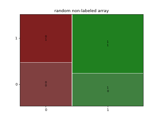
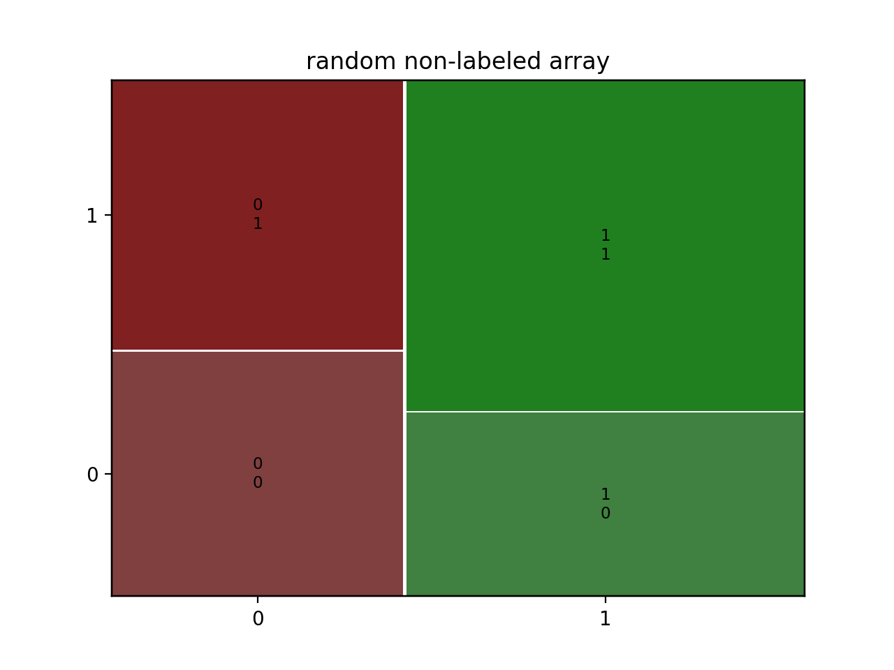
>>> rand = np.random.random
>>> data = 1+rand((2,2))
>>> mosaic(data, title='random non-labeled array')
>>> plt.show()
If you need to modify the labeling and the coloring you can give a function tocreate the labels and one with the graphical properties starting from the key tuple
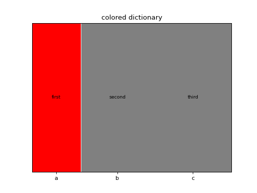
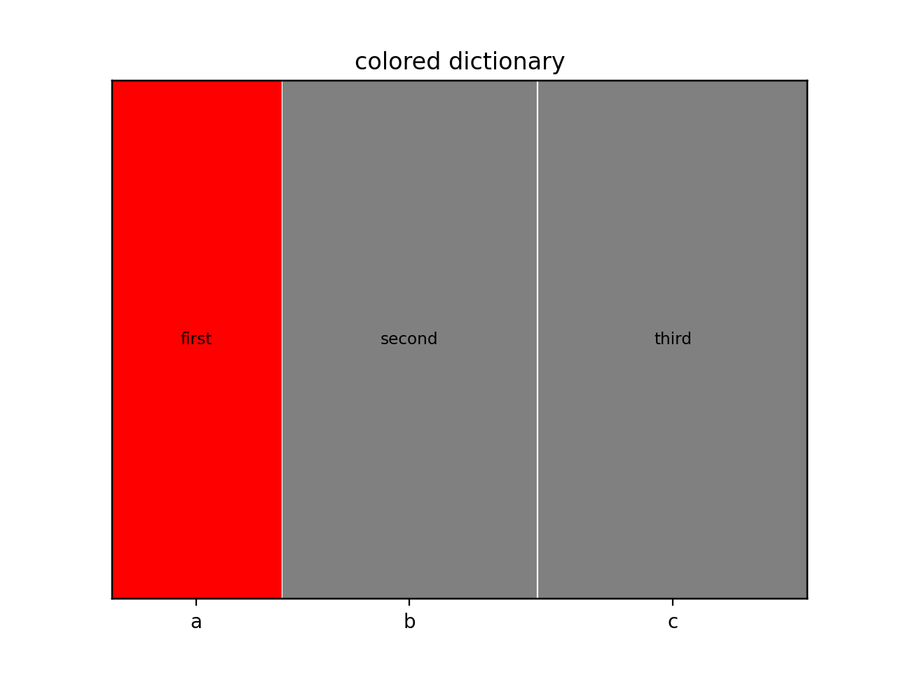
>>> data = {'a': 10, 'b': 15, 'c': 16}
>>> props = lambda key: {'color': 'r' if 'a' in key else 'gray'}
>>> labelizer = lambda k: {('a',): 'first', ('b',): 'second',
...                        ('c',): 'third'}[k]
>>> mosaic(data, title='colored dictionary', properties=props,
...        labelizer=labelizer)
>>> plt.show()
Using a DataFrame as source, specifying the name of the columns of interest
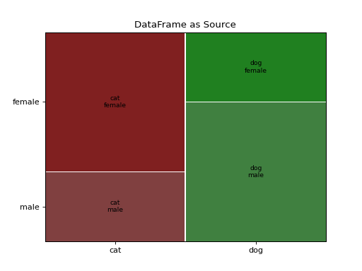
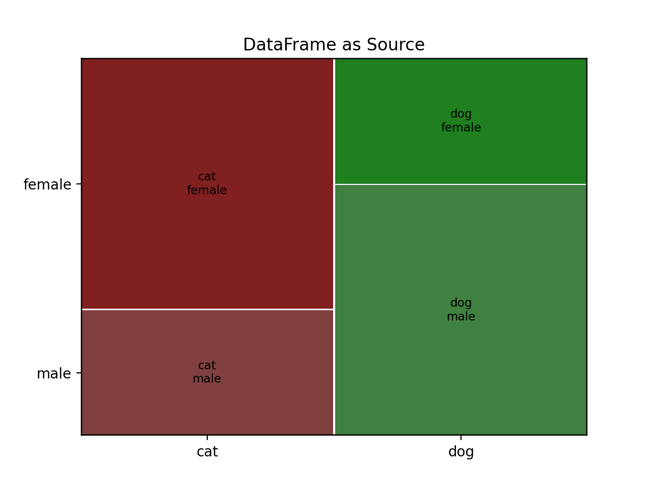
>>> gender = ['male', 'male', 'male', 'female', 'female', 'female']
>>> pet = ['cat', 'dog', 'dog', 'cat', 'dog', 'cat']
>>> data = pd.DataFrame({'gender': gender, 'pet': pet})
>>> mosaic(data, ['pet', 'gender'], title='DataFrame as Source')
>>> plt.show()
(
Source code,png,hires.png,pdf)

