
statsmodels.graphics.regressionplots.plot_fit
-
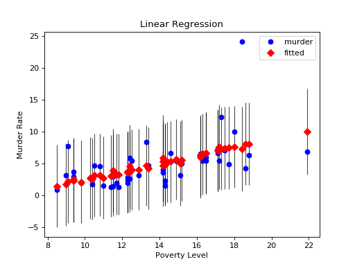
statsmodels.graphics.regressionplots.plot_fit(results, exog_idx, y_true=None, ax=None, **kwargs)[source]¶ Plot fit against one regressor.
This creates one graph with the scatterplot of observed values compared to fitted values.
Parameters: results : result instance
result instance with resid, model.endog and model.exog as attributes
x_var : int or str
Name or index of regressor in exog matrix.
y_true : array_like
(optional) If this is not None, then the array is added to the plot
ax : Matplotlib AxesSubplot instance, optional
If given, this subplot is used to plot in instead of a new figure being created.
kwargs
The keyword arguments are passed to the plot command for the fitted values points.
Returns: fig : Matplotlib figure instance
If ax is None, the created figure. Otherwise the figure to which ax is connected.
Examples
Load the Statewide Crime data set and perform linear regression with poverty and hs_grad as variables and murder as the response
>>> import statsmodels.api as sm
>>> import matplotlib.pyplot as plt
>>> data = sm.datasets.statecrime.load_pandas().data
>>> murder = data['murder']
>>> X = data[['poverty', 'hs_grad']]
>>> X["constant"] = 1
>>> y = murder
>>> model = sm.OLS(y, X)
>>> results = model.fit()
Create a plot just for the variable ‘Poverty’:
>>> fig, ax = plt.subplots()
>>> fig = sm.graphics.plot_fit(results, 0, ax=ax)
>>> ax.set_ylabel("Murder Rate")
>>> ax.set_xlabel("Poverty Level")
>>> ax.set_title("Linear Regression")
>>> plt.show()
(Source code, png, hires.png, pdf)