
statsmodels.graphics.gofplots.ProbPlot
-
class
statsmodels.graphics.gofplots.ProbPlot(data, dist=<scipy.stats._continuous_distns.norm_gen object>, fit=False, distargs=(), a=0, loc=0, scale=1)[source]¶ Class for convenient construction of Q-Q, P-P, and probability plots.
Can take arguments specifying the parameters for dist or fit them automatically. (See fit under kwargs.)
Parameters: - data (array-like) – 1d data array
- dist (A scipy.stats or statsmodels distribution) – Compare x against dist. The default is scipy.stats.distributions.norm (a standard normal).
- distargs (tuple) – A tuple of arguments passed to dist to specify it fully so dist.ppf may be called.
- loc (float) – Location parameter for dist
- a (float) – Offset for the plotting position of an expected order statistic, for example. The plotting positions are given by (i - a)/(nobs - 2*a + 1) for i in range(0,nobs+1)
- scale (float) – Scale parameter for dist
- fit (boolean) – If fit is false, loc, scale, and distargs are passed to the distribution. If fit is True then the parameters for dist are fit automatically using dist.fit. The quantiles are formed from the standardized data, after subtracting the fitted loc and dividing by the fitted scale.
See also
scipy.stats.probplotNotes
- Depends on matplotlib.
- If fit is True then the parameters are fit using the
- distribution’s fit() method.
- The call signatures for the qqplot, ppplot, and probplot
- methods are similar, so examples 1 through 4 apply to all three methods.
- The three plotting methods are summarized below:
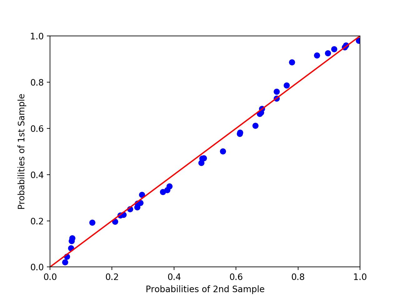
- ppplot : Probability-Probability plot
- Compares the sample and theoretical probabilities (percentiles).
- qqplot : Quantile-Quantile plot
- Compares the sample and theoretical quantiles
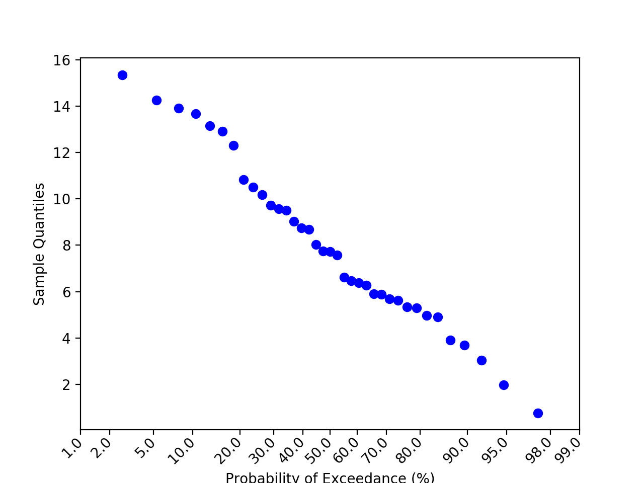
- probplot : Probability plot
- Same as a Q-Q plot, however probabilities are shown in the scale of the theoretical distribution (x-axis) and the y-axis contains unscaled quantiles of the sample data.
Examples
>>> import statsmodels.api as sm
>>> from matplotlib import pyplot as plt
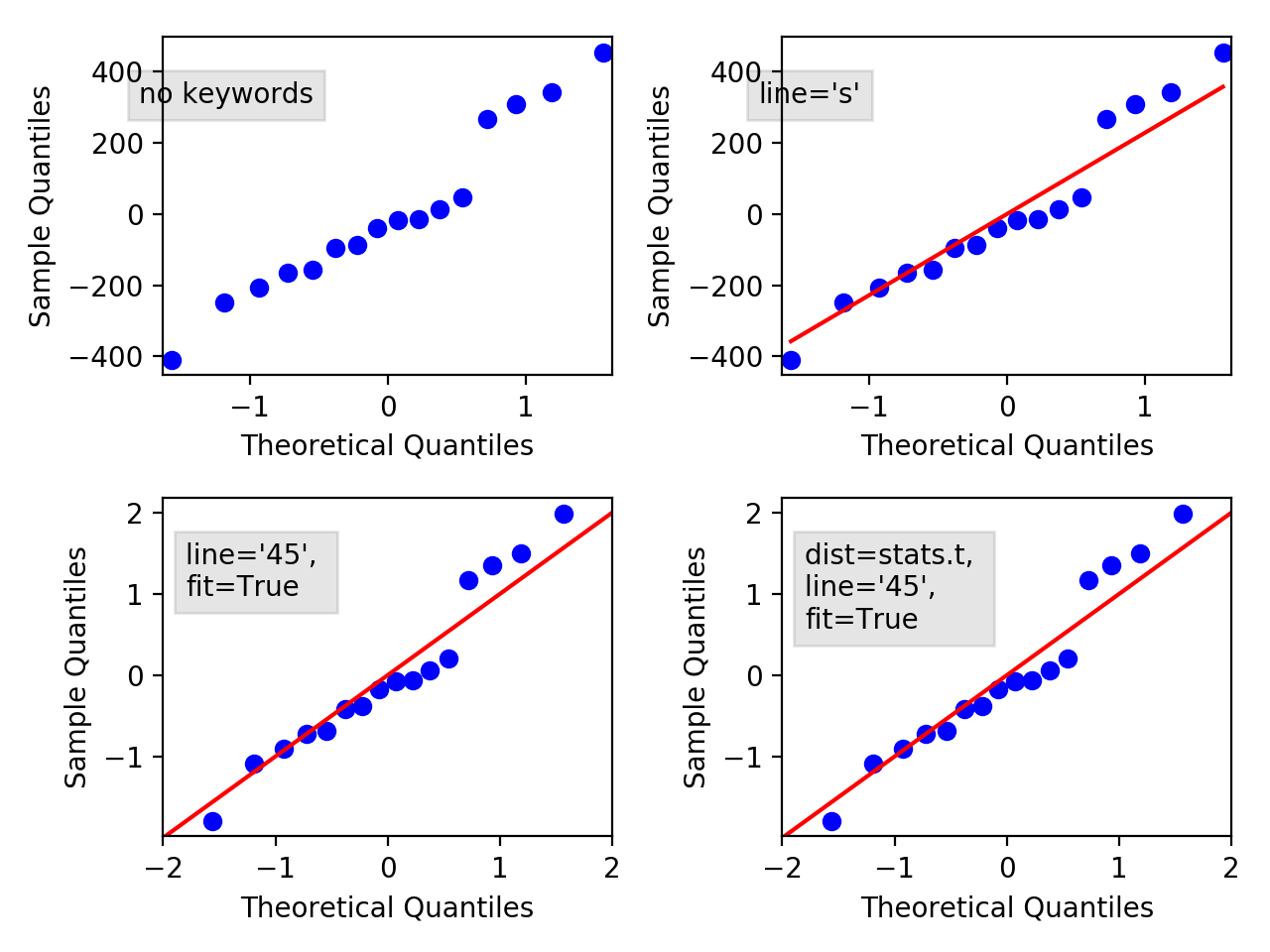
>>> # example 1
>>> data = sm.datasets.longley.load()
>>> data.exog = sm.add_constant(data.exog)
>>> model = sm.OLS(data.endog, data.exog)
>>> mod_fit = model.fit()
>>> res = mod_fit.resid # residuals
>>> probplot = sm.ProbPlot(res)
>>> probplot.qqplot()
>>> plt.show()
qqplot of the residuals against quantiles of t-distribution with 4 degrees of freedom:
>>> # example 2
>>> import scipy.stats as stats
>>> probplot = sm.ProbPlot(res, stats.t, distargs=(4,))
>>> fig = probplot.qqplot()
>>> plt.show()
qqplot against same as above, but with mean 3 and std 10:
>>> # example 3
>>> probplot = sm.ProbPlot(res, stats.t, distargs=(4,), loc=3, scale=10)
>>> fig = probplot.qqplot()
>>> plt.show()
Automatically determine parameters for t distribution including the loc and scale:
>>> # example 4
>>> probplot = sm.ProbPlot(res, stats.t, fit=True)
>>> fig = probplot.qqplot(line='45')
>>> plt.show()
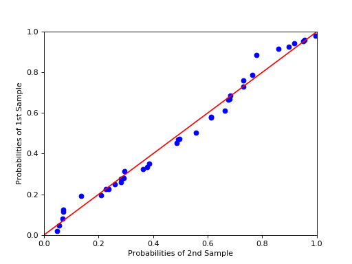
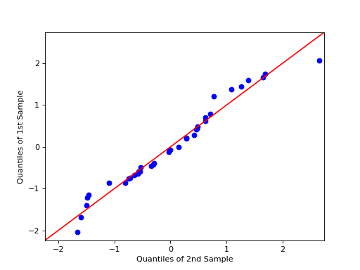
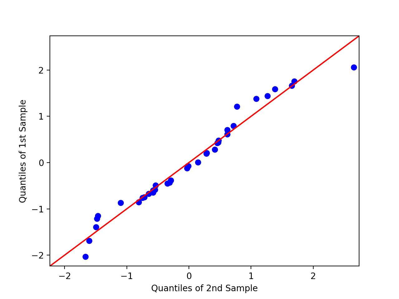
A second ProbPlot object can be used to compare two seperate sample sets by using the other kwarg in the qqplot and ppplot methods.
>>> # example 5
>>> import numpy as np
>>> x = np.random.normal(loc=8.25, scale=2.75, size=37)
>>> y = np.random.normal(loc=8.75, scale=3.25, size=37)
>>> pp_x = sm.ProbPlot(x, fit=True)
>>> pp_y = sm.ProbPlot(y, fit=True)
>>> fig = pp_x.qqplot(line='45', other=pp_y)
>>> plt.show()
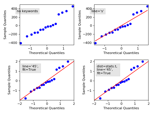
The following plot displays some options, follow the link to see the code.
Methods
ppplot([xlabel, ylabel, line, other, ax])P-P plot of the percentiles (probabilities) of x versus the probabilities (percetiles) of a distribution. probplot([xlabel, ylabel, line, exceed, ax])Probability plot of the unscaled quantiles of x versus the probabilities of a distibution (not to be confused with a P-P plot). qqplot([xlabel, ylabel, line, other, ax])Q-Q plot of the quantiles of x versus the quantiles/ppf of a distribution or the quantiles of another ProbPlot instance. sample_percentiles()sample_quantiles()sorted_data()theoretical_percentiles()theoretical_quantiles()

