Plot Interaction of Categorical Factors
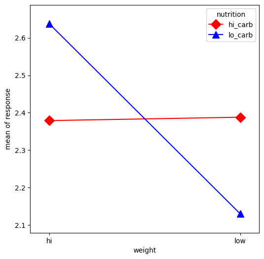
In this example, we will visualize the interaction between categorical factors. First, we will create some categorical data. Then, we will plot it using the interaction_plot function, which internally re-codes the x-factor categories to integers.
[1]:
%matplotlib inline

import matplotlib.pyplot as plt
import numpy as np
import pandas as pd
from statsmodels.graphics.factorplots import interaction_plot
[2]:
np.random.seed(12345)
weight = pd.Series(np.repeat(["low", "hi", "low", "hi"], 15), name="weight")
nutrition = pd.Series(np.repeat(["lo_carb", "hi_carb"], 30), name="nutrition")
days = np.log(np.random.randint(1, 30, size=60))
[3]:
fig, ax = plt.subplots(figsize=(6, 6))
fig = interaction_plot(
    x=weight,
    trace=nutrition,
    response=days,
    colors=["red", "blue"],
    markers=["D", "^"],
    ms=10,
    ax=ax,
)