statsmodels.graphics.functional.hdrboxplot
-
statsmodels.graphics.functional.hdrboxplot(data, ncomp=
2, alpha=None, threshold=0.95, bw=None, xdata=None, labels=None, ax=None, use_brute=False, seed=None, *, kernel_seed=None)[source]¶ High Density Region boxplot
- Parameters:
- datasequence
ofndarraysor 2-Dndarray The vectors of functions to create a functional boxplot from. If a sequence of 1-D arrays, these should all be the same size. The first axis is the function index, the second axis the one along which the function is defined. So
data[0, :]is the first functional curve.- ncomp
int,optional Number of components to use. If None, returns the as many as the smaller of the number of rows or columns in data.
- alpha
listoffloatsbetween0and1,optional Extra quantile values to compute. Default is None
- threshold
floatbetween0and1,optional Percentile threshold value for outliers detection. High value means a lower sensitivity to outliers. Default is 0.95.
- bwarray_like or
str,optional If an array, it is a fixed user-specified bandwidth. If None, set to normal_reference. If a string, should be one of:
normal_reference: normal reference rule of thumb (default)
cv_ml: cross validation maximum likelihood
cv_ls: cross validation least squares
- xdata
ndarray,optional The independent variable for the data. If not given, it is assumed to be an array of integers 0..N-1 with N the length of the vectors in data.
- labelssequence
ofscalar orstr,optional The labels or identifiers of the curves in data. If not given, outliers are labeled in the plot with array indices.
- ax
AxesSubplot,optional If given, this subplot is used to plot in instead of a new figure being created.
- use_brutebool
Use the brute force optimizer instead of the default differential evolution to find the curves. Default is False.
- seed{
None,int,np.random.RandomState} Seed value to pass to scipy.optimize.differential_evolution. Can be an integer or RandomState instance. If None, then the default RandomState provided by np.random is used.
- kernel_seed{
int,Generator,RandomState},optional A seed to use for the kernel density. If None, will use the global RandomState.
Deprecated since version 0.15.0: In release 0.17.0 or after January 2028, whichever comes sooner, using None will initialize a new numpy.random.default_rng using system entropy.
- datasequence
- Returns:
- fig
Figure If ax is None, the created figure. Otherwise the figure to which ax is connected.
- hdr_res
HdrResultsinstance An HdrResults instance with the following attributes:
‘median’, array. Median curve.
‘hdr_50’, array. 50% quantile band. [sup, inf] curves
- ‘hdr_90’, list of array. 90% quantile band. [sup, inf]
curves.
- ‘extra_quantiles’, list of array. Extra quantile band.
[sup, inf] curves.
‘outliers’, ndarray. Outlier curves.
- fig
See also
Notes
The median curve is the curve with the highest probability on the reduced space of a Principal Component Analysis (PCA).
Outliers are defined as curves that fall outside the band corresponding to the quantile given by threshold.
The non-outlying region is defined as the band made up of all the non-outlying curves.
Behind the scene, the dataset is represented as a matrix. Each line corresponding to a 1D curve. This matrix is then decomposed using Principal Components Analysis (PCA). This allows to represent the data using a finite number of modes, or components. This compression process allows to turn the functional representation into a scalar representation of the matrix. In other words, you can visualize each curve from its components. Each curve is thus a point in this reduced space. With 2 components, this is called a bivariate plot (2D plot).
In this plot, if some points are adjacent (similar components), it means that back in the original space, the curves are similar. Then, finding the median curve means finding the higher density region (HDR) in the reduced space. Moreover, the more you get away from this HDR, the more the curve is unlikely to be similar to the other curves.
Using a kernel smoothing technique, the probability density function (PDF) of the multivariate space can be recovered. From this PDF, it is possible to compute the density probability linked to the cluster of points and plot its contours.
Finally, using these contours, the different quantiles can be extracted along with the median curve and the outliers.
Steps to produce the HDR boxplot include:
Compute a multivariate kernel density estimation
Compute contour lines for quantiles 90%, 50% and alpha %
Plot the bivariate plot
Compute median curve along with quantiles and outliers curves.
References
- [1] R.J. Hyndman and H.L. Shang, “Rainbow Plots, Bagplots, and Boxplots for
Functional Data”, vol. 19, pp. 29-45, 2010.
Examples
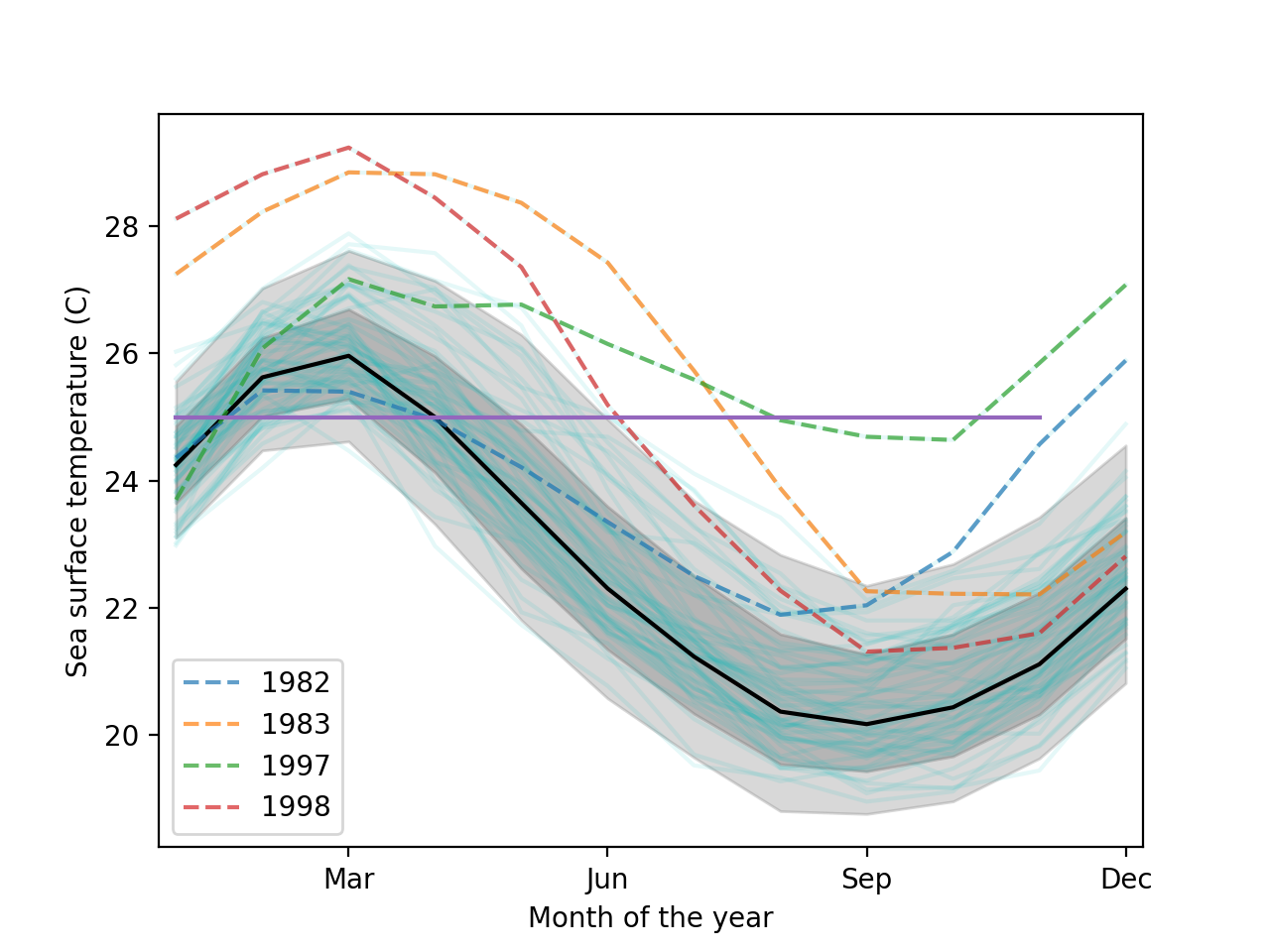
Load the El Nino dataset. Consists of 60 years worth of Pacific Ocean sea surface temperature data.
>>> import matplotlib.pyplot as plt
>>> import statsmodels.api as sm
>>> data = sm.datasets.elnino.load()
Create a functional boxplot. We see that the years 1982-83 and 1997-98 are outliers; these are the years where El Nino (a climate pattern characterized by warming up of the sea surface and higher air pressures) occurred with unusual intensity.
>>> fig = plt.figure()
>>> ax = fig.add_subplot(111)
>>> res = sm.graphics.hdrboxplot(data.raw_data[:, 1:],
...                              labels=data.raw_data[:, 0].astype(int),
...                              ax=ax)
>>> ax.set_xlabel("Month of the year") >>> ax.set_ylabel("Sea surface temperature (C)") >>> ax.set_xticks(np.arange(13, step=3) - 1) >>> ax.set_xticklabels(["", "Mar", "Jun", "Sep", "Dec"]) >>> ax.set_xlim([-0.2, 11.2])>>> plt.show()(
Source code,png,hires.png,pdf)