
statsmodels.graphics.functional.rainbowplot
-
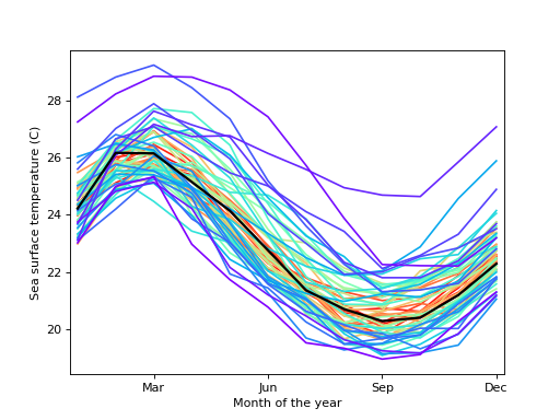
statsmodels.graphics.functional.rainbowplot(data, xdata=None, depth=None, method='MBD', ax=None, cmap=None)[source]¶ Create a rainbow plot for a set of curves.
A rainbow plot contains line plots of all curves in the dataset, colored in order of functional depth. The median curve is shown in black.
- Parameters
- datasequence of ndarrays or 2-D ndarray
The vectors of functions to create a functional boxplot from. If a sequence of 1-D arrays, these should all be the same size. The first axis is the function index, the second axis the one along which the function is defined. So
data[0, :]is the first functional curve.- xdatandarray, optional
The independent variable for the data. If not given, it is assumed to be an array of integers 0..N-1 with N the length of the vectors in data.
- depthndarray, optional
A 1-D array of band depths for data, or equivalent order statistic. If not given, it will be calculated through banddepth.
- method{‘MBD’, ‘BD2’}, optional
The method to use to calculate the band depth. Default is ‘MBD’.
- axMatplotlib AxesSubplot instance, optional
If given, this subplot is used to plot in instead of a new figure being created.
- cmapMatplotlib LinearSegmentedColormap instance, optional
The colormap used to color curves with. Default is a rainbow colormap, with red used for the most central and purple for the least central curves.
- Returns
- figMatplotlib figure instance
If ax is None, the created figure. Otherwise the figure to which ax is connected.
References
- [1] R.J. Hyndman and H.L. Shang, “Rainbow Plots, Bagplots, and Boxplots for
Functional Data”, vol. 19, pp. 29-25, 2010.
Examples
Load the El Nino dataset. Consists of 60 years worth of Pacific Ocean sea surface temperature data.
>>> import matplotlib.pyplot as plt
>>> import statsmodels.api as sm
>>> data = sm.datasets.elnino.load(as_pandas=False)
Create a rainbow plot:
>>> fig = plt.figure()
>>> ax = fig.add_subplot(111)
>>> res = sm.graphics.rainbowplot(data.raw_data[:, 1:], ax=ax)
>>> ax.set_xlabel("Month of the year")
>>> ax.set_ylabel("Sea surface temperature (C)")
>>> ax.set_xticks(np.arange(13, step=3) - 1)
>>> ax.set_xticklabels(["", "Mar", "Jun", "Sep", "Dec"])
>>> ax.set_xlim([-0.2, 11.2])
>>> plt.show()
(Source code, png, hires.png, pdf)