statsmodels.graphics.correlation.plot_corr
-
statsmodels.graphics.correlation.plot_corr(dcorr, xnames=
None, ynames=None, title=None, normcolor=False, ax=None, cmap='RdYlBu_r')[source]¶ Plot correlation of many variables in a tight color grid.
- Parameters:
- dcorr
ndarray Correlation matrix, square 2-D array.
- xnames
list[str],optional Labels for the horizontal axis. If not given (None), then the matplotlib defaults (integers) are used. If it is an empty list, [], then no ticks and labels are added.
- ynames
list[str],optional Labels for the vertical axis. Works the same way as xnames. If not given, the same names as for xnames are re-used.
- title
str,optional The figure title. If None, the default (‘Correlation Matrix’) is used. If
title='', then no title is added.- normcolorbool or
tupleofscalars,optional If False (default), then the color coding range corresponds to the range of dcorr. If True, then the color range is normalized to (-1, 1). If this is a tuple of two numbers, then they define the range for the color bar.
- ax
AxesSubplot,optional If ax is None, then a figure is created. If an axis instance is given, then only the main plot but not the colorbar is created.
- cmap
strorMatplotlibColormapinstance,optional The colormap for the plot. Can be any valid Matplotlib Colormap instance or name.
- dcorr
- Returns:
FigureIf ax is None, the created figure. Otherwise the figure to which ax is connected.
Examples
>>> import numpy as np
>>> import matplotlib.pyplot as plt
>>> import statsmodels.graphics.api as smg
>>> hie_data = sm.datasets.randhie.load_pandas() >>> corr_matrix = np.corrcoef(hie_data.data.T) >>> smg.plot_corr(corr_matrix, xnames=hie_data.names) >>> plt.show()(
Source code,png,hires.png,pdf)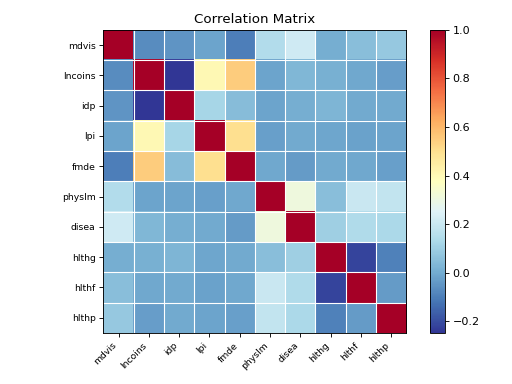