statsmodels.graphics.tsaplots.quarter_plot
-
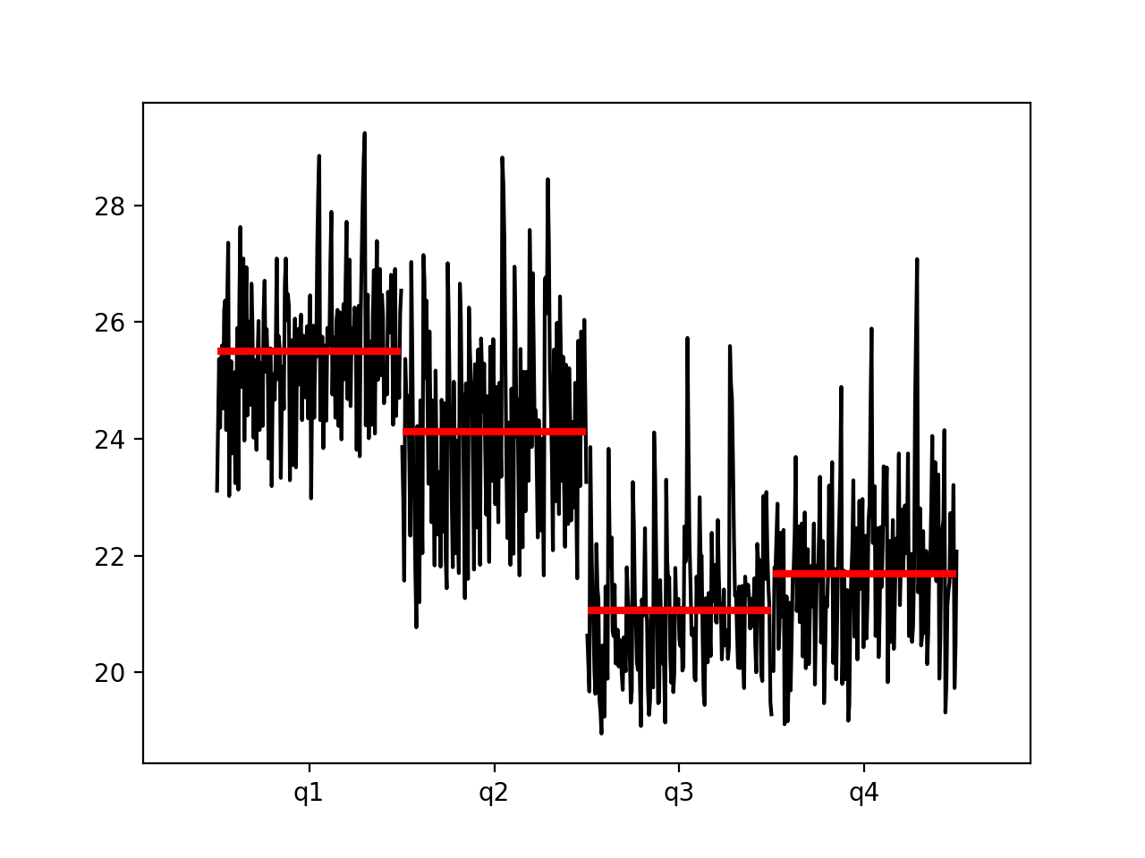
statsmodels.graphics.tsaplots.quarter_plot(x, dates=
None, ylabel=None, ax=None)[source]¶ Seasonal plot of quarterly data
- Parameters:
- xarray_like
Seasonal data to plot. If dates is None, x must be a pandas object with a PeriodIndex or DatetimeIndex with a monthly frequency.
- datesarray_like,
optional If x is not a pandas object, then dates must be supplied.
- ylabel
str,optional The label for the y-axis. Will attempt to use the name attribute of the Series.
- ax
matplotlib.axes,optional Existing axes instance.
- Returns:
FigureIf ax is provided, the Figure instance attached to ax. Otherwise a new Figure instance.
Examples
>>> import statsmodels.api as sm
>>> import pandas as pd
>>> dta = sm.datasets.elnino.load_pandas().data >>> dta['YEAR'] = dta.YEAR.astype(int).astype(str) >>> dta = dta.set_index('YEAR').T.unstack() >>> dates = pd.to_datetime(list(map(lambda x: '-'.join(x) + '-1', ... dta.index.values))) >>> dta.index = dates.to_period('Q') >>> fig = sm.graphics.tsa.quarter_plot(dta)(
Source code,png,hires.png,pdf)