statsmodels.graphics.regressionplots.plot_fit
-
statsmodels.graphics.regressionplots.plot_fit(results, exog_idx, y_true=
None, ax=None, vlines=True, **kwargs)[source]¶ Plot fit against one regressor.
This creates one graph with the scatterplot of observed values compared to fitted values.
- Parameters:
- results
Results A result instance with resid, model.endog and model.exog as attributes.
- exog_idx{
int,str} Name or index of regressor in exog matrix.
- y_truearray_like.
optional If this is not None, then the array is added to the plot.
- ax
AxesSubplot,optional If given, this subplot is used to plot in instead of a new figure being created.
- vlinesbool,
optional If this not True, then the uncertainty (pointwise prediction intervals) of the fit is not plotted.
- **kwargs
The keyword arguments are passed to the plot command for the fitted values points.
- results
- Returns:
FigureIf ax is None, the created figure. Otherwise the figure to which ax is connected.
Examples
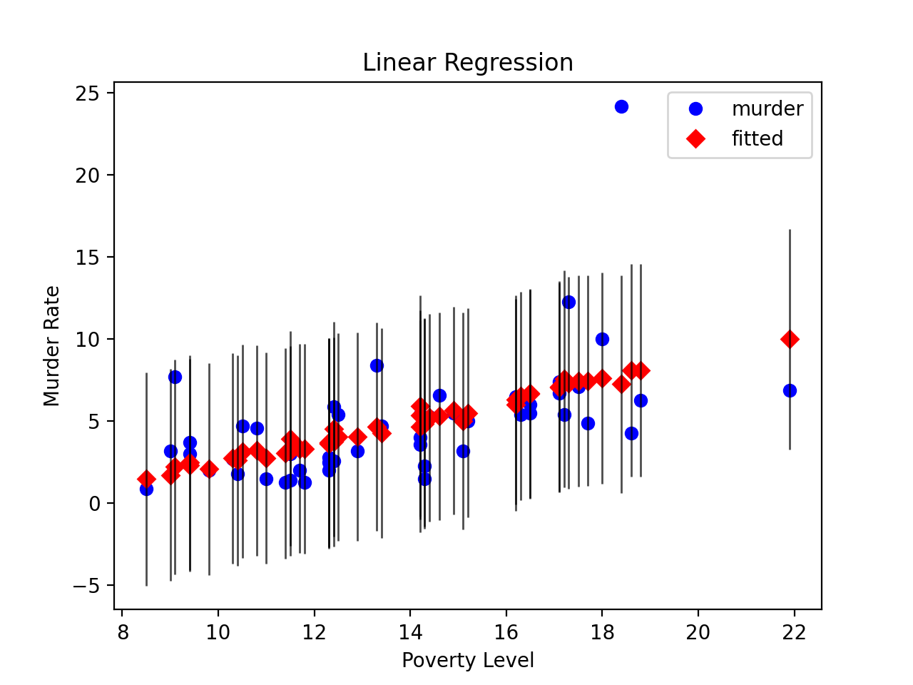
Load the Statewide Crime data set and perform linear regression with poverty and hs_grad as variables and murder as the response
>>> import statsmodels.api as sm
>>> import matplotlib.pyplot as plt
>>> data = sm.datasets.statecrime.load_pandas().data >>> murder = data['murder'] >>> X = data[['poverty', 'hs_grad']]>>> X["constant"] = 1 >>> y = murder >>> model = sm.OLS(y, X) >>> results = model.fit()Create a plot just for the variable ‘Poverty.’ Note that vertical bars representing uncertainty are plotted since vlines is true
>>> fig, ax = plt.subplots()
>>> fig = sm.graphics.plot_fit(results, 0, ax=ax)
>>> ax.set_ylabel("Murder Rate")
>>> ax.set_xlabel("Poverty Level")
>>> ax.set_title("Linear Regression")
>>> plt.show()(
Source code,png,hires.png,pdf)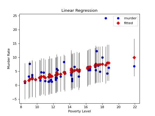