
Plot Interaction of Categorical Factors#
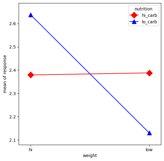
In this example, we will visualize the interaction between categorical factors. First, we will create some categorical data. Then, we will plot it using the interaction_plot function, which internally re-codes the x-factor categories to integers.
[1]:
%matplotlib inline

import matplotlib.pyplot as plt
import numpy as np
import pandas as pd

from statsmodels.graphics.factorplots import interaction_plot
[2]:
np.random.seed(12345)
weight = pd.Series(np.repeat(["low", "hi", "low", "hi"], 15), name="weight")
nutrition = pd.Series(np.repeat(["lo_carb", "hi_carb"], 30), name="nutrition")
days = np.log(np.random.randint(1, 30, size=60))
[3]:
fig, ax = plt.subplots(figsize=(6, 6))
fig = interaction_plot(
    x=weight,
    trace=nutrition,
    response=days,
    colors=["red", "blue"],
    markers=["D", "^"],
    ms=10,
    ax=ax,
)